Public Transport Accessibility Audit: Your Website & App Checklist Template
Published: 09/26/2025 Updated: 12/13/2025
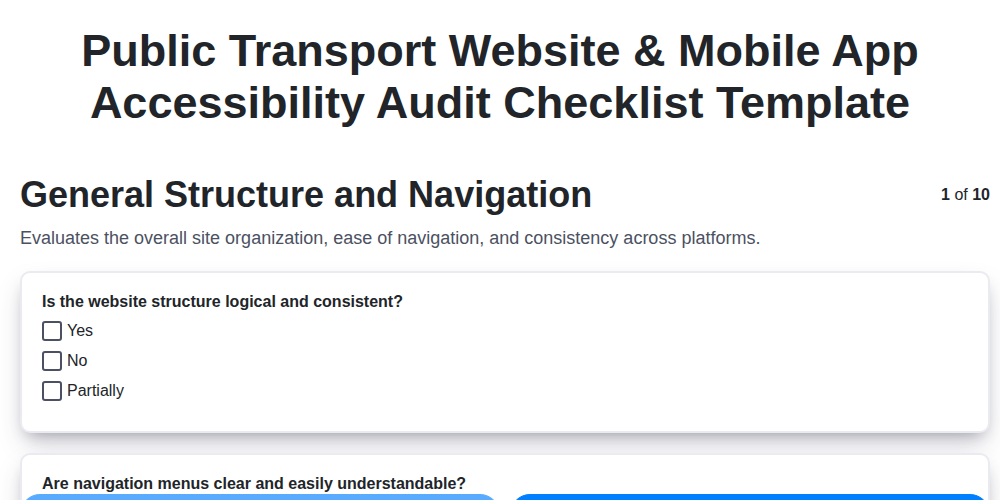
Table of Contents
- Why Public Transport Accessibility Matters
- Getting Started: Understanding Accessibility Standards
- Website Accessibility Audit: A Detailed Checklist
- Mobile App Accessibility Audit (iOS & Android)
- Keyboard Navigation and Screen Reader Compatibility
- Color Contrast, Image Alt Text, and Form Accessibility
- Video and Audio Accessibility Guidelines
- Dynamic Content and Real-Time Updates
- Content Clarity and User-Friendly Language
- Testing and Validation: Ensuring Accessibility
- Continuous Improvement: Maintaining Accessibility
- Resources & Links
TLDR: Ensure your public transport website & app are accessible to everyone! This checklist template guides you through key areas like navigation, screen reader compatibility, color contrast, and form accessibility. Use it to identify & fix issues, creating a more inclusive experience for all riders - it's your easy-to-follow roadmap to accessibility compliance.
Why Public Transport Accessibility Matters
Beyond legal requirements-like the Americans with Disabilities Act (ADA) and Web Content Accessibility Guidelines (WCAG)-accessible public transport websites and mobile apps offer significant benefits for everyone. Consider this:
- Expanded Reach: An accessible platform opens your services to a much wider audience, including individuals with visual, auditory, motor, and cognitive disabilities. This translates to increased ridership and community engagement.
- Improved Usability: Accessibility best practices often lead to a cleaner, more intuitive design for all users. Clear navigation, logical information architecture, and simple language enhance the overall user experience.
- Enhanced Reputation: Demonstrating a commitment to inclusivity builds trust and strengthens your organization's reputation within the community.
- Reduced Support Costs: A well-designed, accessible platform often reduces the need for user support, freeing up resources for other priorities.
- Future-Proofing: As technology evolves and more people rely on digital access to public services, prioritizing accessibility now prepares your organization for long-term success.
Getting Started: Understanding Accessibility Standards
Navigating the world of accessibility standards can feel overwhelming, but a few core guidelines form the foundation. The most widely recognized and adhered-to standard is the Web Content Accessibility Guidelines (WCAG), published by the World Wide Web Consortium (W3C). WCAG isn't a law itself, but it provides a set of internationally agreed-upon success criteria for making web content more accessible.
WCAG is structured around four principles, often remembered by the acronym POUR:
- Perceivable: Information and user interface components must be presentable to users in ways they can perceive. This includes providing text alternatives for non-text content (like images), providing captions for audio and video, and ensuring content is distinguishable from the background.
- Operable: User interface components and navigation must be operable. This means users can access and interact with content using a variety of input methods, including keyboard navigation and assistive technologies.
- Understandable: Information and the operation of the user interface must be understandable. Content should be presented clearly and concisely, using plain language and predictable navigation.
- Robust: Content should be robust enough to be interpreted reliably by a wide variety of user agents, including assistive technologies. This means adhering to web standards and ensuring compatibility across different browsers and devices.
Beyond WCAG, various legal frameworks and guidelines mandate accessibility. In the United States, the Americans with Disabilities Act (ADA) has been interpreted to apply to websites, requiring public entities to ensure their online services are accessible. Similar legislation exists in many other countries. Understanding these underlying standards is the crucial first step in building a truly inclusive digital experience.
Website Accessibility Audit: A Detailed Checklist
A thorough website accessibility audit goes beyond surface-level checks. This detailed checklist breaks down key areas, providing specific steps to ensure your public transport website meets accessibility standards. Remember to test with assistive technologies (screen readers, keyboard navigation) throughout the process.
1. Structural Elements & Semantic HTML:
- Heading Hierarchy: Verify proper use of
<h1>through<h6>tags, reflecting logical content structure. Avoid using headings solely for visual styling. - Landmark Roles: Utilize HTML5 semantic elements (
<nav>,<main>,<aside>,<footer>,<header>) or ARIA landmark roles (role=navigation,role=main) to define distinct content areas. - Skip Navigation Links: Implement a clearly identifiable Skip to Content link at the top of the page, enabling keyboard users to bypass repetitive navigation blocks.
- Consistent Page Structure: Maintain a predictable layout and navigation across all pages.
2. Navigation & Link Accessibility:
- Descriptive Link Text: Ensure link text is meaningful and accurately describes the destination. Avoid generic phrases like click here.
- Keyboard Navigation: Verify all navigation elements (menus, tabs, accordions) are fully navigable using the keyboard alone (Tab, Shift+Tab, Enter, Arrow keys). Focus indicators must be clearly visible.
- ARIA Menu Roles: For complex navigation menus, utilize ARIA roles like
role=menu,role=menuitem, androle=submenuto provide semantic information to assistive technologies. - Focus Management: Implement proper focus management when interactive elements gain or lose focus (e.g., expanding a dropdown menu).
3. Image Accessibility:
- Meaningful
altText: Provide concise and descriptivealttext for all images that convey important information. Decorative images should have emptyalt=attributes. - Complex Image Descriptions: For images with significant visual information (charts, infographics), consider providing a more detailed explanation in surrounding text or a long description via
aria-describedby. - Image Captions: Use captions to provide additional context or explanation for images.
4. Form Accessibility:
- Proper Label Association: Associate labels with form fields using the
<label>element'sforattribute, linking it to the field'sid. - Error Handling: Provide clear and specific error messages when form validation fails. Indicate the problematic fields and provide instructions for correction. Use ARIA attributes (
aria-invalid) to signal errors to assistive technologies. - Instructions & Help Text: Provide clear instructions and help text for complex form fields.
- Fieldset and Legend: Group related form fields using
<fieldset>and<legend>elements for better organization.
5. Color & Contrast:
- Sufficient Color Contrast: Ensure sufficient color contrast between text and background colors, meeting WCAG 2.1 AA or AAA guidelines (minimum contrast ratio of 4.5: 1 for normal text and 3: 1 for large text). Use a color contrast checker tool.
- Color as the Only Indicator: Avoid using color as the sole means of conveying information or indicating interactive elements. Provide alternative indicators (text, symbols, patterns).
6. Multimedia Accessibility (Video & Audio):
- Captions and Transcripts: Provide accurate captions for all videos and transcripts for all audio content.
- Audio Descriptions: For videos with significant visual information, provide audio descriptions that narrate the visual elements.
- Keyboard Control: Ensure all multimedia players are fully controllable via the keyboard.
7. Dynamic Content & AJAX:
- Announce Updates: Use ARIA live regions (
aria-live=politeoraria-live=assertive) to announce dynamic content updates to screen readers. - Focus Management: Ensure focus is appropriately managed when dynamic content appears or disappears.
This checklist is a starting point for a thorough accessibility audit. Remember to involve users with disabilities in the testing process to gain valuable insights.
Mobile App Accessibility Audit (iOS & Android)
Mobile accessibility isn't just about a responsive design; it's about ensuring users with disabilities can effectively interact with your public transport app. Here's a more detailed look at key accessibility considerations for both iOS and Android platforms:
iOS Accessibility - Leveraging VoiceOver & UIKit
- Native UI Elements are Key: Apple prioritizes accessibility within its native UIKit framework. Utilizing these elements (buttons, labels, navigation bars) ensures VoiceOver compatibility is largely built-in. Avoid custom UI implementations unless absolutely necessary and meticulously test them.
- Accessibility Inspector: Utilize Xcode's Accessibility Inspector to identify accessibility issues. It helps determine if elements have proper accessibility labels, hints, and traits.
UIAccessibilityProtocol: For custom controls or elements, implement theUIAccessibilityProtocolto provide accessibility information to VoiceOver. This includes setting accessible names, descriptions, and behaviors.- Dynamic Type Support: Ensure your app respects system font size preferences using Dynamic Type. Elements shouldn't overlap or become illegible when larger fonts are selected.
- VoiceOver Hints: Provide helpful hints to guide VoiceOver users through complex interactions or sequences.
- Focus Order: Pay careful attention to the logical order in which elements receive focus when navigating with VoiceOver. It should be intuitive and predictable.
Android Accessibility - Utilizing TalkBack & Accessibility APIs
- Content Descriptions: Provide meaningful content descriptions (
android: contentDescription) for all interactive elements that don't have visible text labels. This allows TalkBack to convey information to the user. - TalkBack Simulator: Use the TalkBack simulator within Android Studio to experience your app as a TalkBack user.
- Accessibility Delegate: Consider using an AccessibilityDelegate to customize the accessibility behavior of specific views without modifying their underlying code.
- Focus Traversal: Ensure a logical and consistent focus order for all interactive elements.
- Adjustable Font Sizes: Support adjustable font sizes through the
android: textScaleXandandroid: textScaleYattributes, and test thoroughly at various sizes. - Touch Target Sizes: Adhere to Google's recommendations for minimum touch target sizes (48dp) to ensure ease of interaction for users with motor impairments.
- State Descriptions: Use
AccessibilityEventto announce changes in the state of elements, for instance, when a button changes from disabled to enabled.
Keyboard Navigation and Screen Reader Compatibility
For users who rely on keyboard navigation or screen readers, a website or app's usability hinges on how well it accommodates these assistive technologies. Keyboard navigation should be intuitive and predictable, allowing users to access all interactive elements (links, buttons, form fields) without a mouse. This means ensuring a logical focus order - the order in which elements receive keyboard focus - and clearly visible focus indicators to show where the focus currently lies. Avoid keyboard traps where focus gets stuck in a specific element, preventing users from progressing.
Screen reader compatibility is equally critical. These tools vocalize the content of a webpage or app, allowing visually impaired users to hear the information. Semantic HTML is the foundation for screen reader compatibility, providing structure and context. For example, using <article> instead of a generic <div> tells the screen reader that this is a distinct piece of content. ARIA (Accessible Rich Internet Applications) attributes can be used to enhance accessibility where semantic HTML is insufficient, but use them judiciously - incorrect implementation can actually reduce accessibility. Regularly test with popular screen readers like NVDA, VoiceOver, and TalkBack to ensure a seamless experience. Remember that a well-structured website, built with accessibility in mind from the outset, dramatically improves the experience for everyone, not just those using assistive technologies.
Color Contrast, Image Alt Text, and Form Accessibility
These three areas often present significant accessibility barriers, yet are relatively straightforward to address with focused effort. Let's break them down.
Color Contrast: Seeing is Believing (for Everyone)
Insufficient color contrast is a common issue, particularly for users with low vision or color blindness. The Web Content Accessibility Guidelines (WCAG) 2.1 require a minimum contrast ratio of 4.5: 1 for normal text and 3: 1 for large text (18pt or 14pt bold). Don't assume it looks fine - use a color contrast checker tool (like the WebAIM Color Contrast Checker ) to verify compliance. Consider the impact on users with different types of color blindness; simulation tools can help you identify potential issues that might be invisible to those with normal vision. Beyond minimum requirements, higher contrast ratios generally enhance readability for everyone.
Image Alt Text: Telling the Story of a Picture
Alternative text (alt text) is crucial for users who can't see the image, whether due to a visual impairment or a broken connection. It allows screen readers to describe the image content. Here's a breakdown:
- Informative Images: Provide concise and descriptive alt text that conveys the image's purpose and content. For example, Photograph of a crowded bus stop with people waiting for the 7: 15 AM bus.
- Decorative Images: Use an empty
alt=attribute for purely decorative images that don't convey any meaningful information. This signals to screen readers to ignore them. - Complex Images (Charts, Graphs): Provide a more detailed description, potentially linking to a text equivalent of the data.
- Functional Images (Buttons, Links): The alt text should describe the function of the image. For instance, an image that acts as a Submit button should have
alt=Submit form. - Context is Key: The best alt text depends on the context of the image.
Form Accessibility: Making Interactions Seamless
Forms are often a critical part of the user journey, and inaccessibility can be incredibly frustrating. Focus on these key areas:
- Label Every Field: Associate labels with every form field using the
<label>element. This ensures screen readers announce the field's purpose. - Use ARIA Attributes: Utilize ARIA attributes (like
aria-required,aria-invalid,aria-describedby) to provide additional context to assistive technologies. - Error Handling: Provide clear and concise error messages that are linked to the relevant form fields. Indicate required fields.
- Keyboard Navigation: Ensure all form elements are navigable and operable using only the keyboard. Focus indicators should be clearly visible.
- Grouping Related Fields: Use
<fieldset>and<legend>elements to group related form fields logically.
Video and Audio Accessibility Guidelines
Providing accessible video and audio content is paramount for riders who rely on visual or auditory alternatives. Here's a breakdown of essential guidelines:
Captions & Subtitles: Captions are synchronized text that displays the dialogue and other relevant sounds (e.g., train announcements, sirens) in a video. Subtitles primarily display dialogue. Providing both is ideal. Ensure captions are accurate, synchronized, and well-formatted (clear font, sufficient contrast).
Transcripts: A transcript is a text-based version of the audio content. It's essential for users who cannot hear or prefer to read along. Transcripts should include all spoken content, sound effects, and other relevant audio cues. Provide transcripts in a downloadable format (e.g., .txt, .docx).
Audio Descriptions: For videos with significant visual information (e.g., maps, gestures, facial expressions) that aren't conveyed in the audio track, provide audio descriptions. These narrated descriptions fill in the gaps, providing context for visually impaired users. Consider hiring a professional audio description service for quality and accuracy.
Playback Controls: Ensure video and audio players have accessible playback controls (play, pause, volume, captions on/off). These controls should be operable via keyboard and screen readers. Use semantic HTML (e.g., <video> and <audio> elements) for better accessibility.
Alternative Formats: When possible, offer content in multiple formats to cater to different user preferences and assistive technologies. For example, offer videos with and without captions, or provide audio-only versions of videos.
Dynamic Content and Real-Time Updates
Public transportation thrives on real-time information: arrival times, delays, route changes, service alerts. However, these dynamic updates can often create accessibility barriers if not implemented correctly. Screen reader users, for instance, might be bombarded with a stream of unannounced changes, leaving them disoriented and unable to effectively plan their journey.
To ensure accessibility of dynamic content:
- Use ARIA Live Regions: Implement
aria-live=politeoraria-live=assertiveto announce updates to screen readers.politeis generally preferred as it minimizes disruption, whileassertiveshould be reserved for critical announcements that require immediate attention. Avoid overuse; frequent assertive announcements can be overwhelming. - Semantic Updates: Structure updates semantically. Rather than simply announcing Delay, specify what is delayed, by how much, and the affected route. For example, Route 14 bus delayed by 10 minutes due to traffic.
- Focus Management: Ensure keyboard focus moves appropriately after an update. Ideally, focus should move to the newly announced content, allowing users to immediately access the information.
- Timestamps/History: Consider providing a log or history of recent updates, allowing users to review past changes.
- Avoid Automatic Refreshes: While automatic refreshes can be tempting, they can disrupt screen reader users. Instead, use push notifications or ARIA live regions to announce updates as they occur.
- Testing: Thoroughly test dynamic content updates with screen readers (both iOS VoiceOver and Android TalkBack) to ensure they are announced correctly and do not cause confusion.
Content Clarity and User-Friendly Language
Technical jargon and complex sentence structures can be major barriers for many users - especially those with cognitive disabilities or those who are not native speakers of the language the website/app is in. Strive to communicate clearly and concisely.
Here's how to make your content more accessible:
- Use Simple Words: Replace complicated words with simpler alternatives. For example, instead of utilize, use use.
- Short Sentences: Break down long, convoluted sentences into shorter, easier-to-understand sentences.
- Active Voice: Favor active voice over passive voice. (e.g., The bus arrives is clearer than The bus is arrived.)
- Define Acronyms: Always spell out acronyms the first time they are used, followed by the acronym in parentheses. (e.g., Real-Time Information System (RTIS)).
- Avoid Idioms: Idiomatic expressions can be confusing. Opt for direct and literal language.
- Use Headings and Lists: Structure your content with clear headings and bulleted/numbered lists to improve readability and scannability.
- Consider Translation: If your audience includes non-native speakers, prioritize clear and simple language to facilitate translation.
- User Feedback: Regularly solicit feedback from users with diverse backgrounds and abilities to identify areas where the language can be improved.
Testing and Validation: Ensuring Accessibility
Automated tools are a helpful starting point, but they can only identify a portion of potential accessibility issues. True validation requires a multi-faceted testing approach involving both automated and manual techniques, and crucially, incorporating feedback from users with disabilities.
Automated Testing: Regularly run automated accessibility checkers like WAVE, Axe DevTools, and Lighthouse. While these tools highlight potential problems, remember they don't provide a definitive diagnosis - a human review is always necessary.
Manual Testing with Assistive Technologies: This is the most critical step. Test your website or app using screen readers (JAWS, NVDA, VoiceOver, TalkBack), keyboard navigation only, and zoom functionality. Simulate color blindness to ensure adequate contrast. These hands-on evaluations reveal nuances automated tools often miss.
User Testing with People with Disabilities: Direct feedback from users with diverse disabilities is invaluable. Organize user testing sessions where participants complete common tasks while you observe and gather feedback. Be prepared to iterate on your design based on this feedback. Pay particular attention to comments regarding navigation, form completion, and the comprehension of information.
Code Reviews: Integrate accessibility checks into your development workflow. Code reviews should include an assessment of HTML structure, ARIA attributes, and the implementation of accessibility best practices.
Regression Testing: After any updates or changes, re-run your accessibility tests to ensure that new code hasn't introduced any regressions or broken existing accessibility features. Consistency is key to a continuously accessible experience.
Continuous Improvement: Maintaining Accessibility
Accessibility isn't a one-and-done project; it's an ongoing commitment. After your initial audit and remediation efforts, establishing a process for continuous improvement is crucial for long-term success. Here's how to build that into your workflow:
- Regular Audits: Schedule recurring accessibility audits (at least annually, but ideally more frequently) to catch new issues arising from content updates, design changes, or evolving accessibility guidelines.
- Accessibility Champions: Designate accessibility champions within your team-individuals who champion accessible practices and act as a point of contact for accessibility-related questions.
- Integrate Accessibility into Development: Make accessibility a core consideration during the design and development phases, rather than an afterthought. This includes training developers and designers on accessibility best practices.
- User Feedback Loop: Establish a clear channel for users to report accessibility issues. Actively respond to and address feedback promptly. Consider incorporating accessibility testing into your beta program.
- Stay Informed: Accessibility guidelines and technologies are constantly evolving. Subscribe to accessibility newsletters, follow accessibility experts on social media, and attend relevant conferences to stay up-to-date.
- Automated Testing Integration: Integrate automated accessibility testing tools into your continuous integration/continuous delivery (CI/CD) pipeline to catch issues early and prevent regressions.
Resources & Links
- Web Accessibility Initiative (WAI) : The definitive source for understanding Web Content Accessibility Guidelines (WCAG) and related accessibility standards. Provides comprehensive documentation, tutorials, and resources for web accessibility.
- U.S. Department of Justice - ADA : Provides information and resources about the Americans with Disabilities Act (ADA), including accessibility requirements for public transportation and digital platforms.
- Section 508 Standards : Provides information about Section 508 requirements, which mandate accessibility for federal agencies and their websites and software. Offers guidance applicable to public transport services.
- Apple Developer Accessibility : Resources and documentation specifically for developing accessible iOS and macOS applications. Crucial for mobile app accessibility audits.
- Android Accessibility : Provides guidelines and APIs for creating accessible Android applications. Essential for conducting Android mobile app accessibility audits.
- WebAIM WAVE : An automated accessibility checker that can identify many accessibility errors on websites and web applications. A useful tool for initial scans.
- Microsoft Accessibility Insights : A suite of tools for accessibility testing, including automated and manual checks for web and mobile apps. Provides comprehensive analysis.
- A11y Project : A community-driven resource for web accessibility. Features articles, checklists, and inspiration for accessible design and development.
- Nomensa : Accessibility consultancy and training provider. Offers a wealth of resources, blog posts, and tools for understanding and implementing accessibility best practices.
- Deque Systems : Accessibility consulting, auditing, and training company. Offers tools like axe DevTools for accessibility testing and a vast library of accessibility resources.
- Level Access : Offers accessibility testing tools and services for websites and digital content. Provides resources for assessing and remediating accessibility issues.
- W3C Cognitive Accessibility Guidelines : Focuses on making web content more accessible for users with cognitive disabilities. Particularly relevant for public transport information, which must be easily understood.
Frequently Asked Questions
What is a Public Transport Accessibility Audit?
A Public Transport Accessibility Audit assesses how accessible your website and app are for people with disabilities. It goes beyond basic compliance, aiming to identify usability issues and ensure a positive experience for all users, including those with visual, auditory, motor, and cognitive impairments.
Why is this audit important for my public transport website/app?
Accessibility is not only a legal requirement in many regions, but it also expands your reach to a wider audience. Ignoring accessibility excludes potential riders, damages your brand reputation, and can lead to legal challenges. A good user experience fosters inclusivity and satisfaction for all.
Who is this checklist template for?
This checklist template is designed for website and app developers, accessibility specialists, designers, and anyone involved in maintaining or improving public transport digital platforms. It's suitable for both new projects and existing websites/apps.
What kind of disabilities does this checklist address?
The checklist covers a broad range of disabilities, including visual impairments (blindness, low vision, color blindness), auditory impairments (deafness, hard of hearing), motor impairments (difficulty using a mouse or keyboard), and cognitive impairments (learning disabilities, memory issues).
How should I use this checklist template?
Review each item in the checklist and assess your website/app's current state. Mark items as 'Pass,' 'Fail,' or 'Not Applicable.' Document any failures and create a plan to remediate them. Prioritize fixes based on severity and impact.
Is this checklist a substitute for a full accessibility audit?
No, this checklist is a helpful tool for self-assessment and identifying common issues. However, it's recommended to conduct a full accessibility audit by a qualified professional for comprehensive evaluation and verification of compliance with accessibility standards like WCAG.
What does WCAG stand for, and why is it important?
WCAG stands for Web Content Accessibility Guidelines. It's the internationally recognized standard for web accessibility, providing a set of guidelines to make online content more accessible to people with disabilities. Adhering to WCAG ensures a higher level of accessibility and inclusivity.
What is the difference between 'Pass,' 'Fail,' and 'Not Applicable'?
'Pass' means the website/app meets the guideline. 'Fail' means the guideline is not met and needs remediation. 'Not Applicable' means the guideline doesn't apply to the specific section of your website/app.
Can I customize this checklist template?
Yes, absolutely! This checklist is intended to be a starting point. Feel free to add, remove, or modify items to best suit the specific needs and features of your public transport website/app.
Found this Article helpful?
Public Transport Management Solution Demo
Optimize public transport operations & enhance passenger experience! ChecklistGuro streamlines route planning, vehicle maintenance, and incident reporting. Improve efficiency, safety, and reliability. Manage it all with our Work OS.
Related Articles
Train Depot Emergency Audit: Your Checklist Template for Safety
Mastering the Crush: Your Public Transport Crowded Conditions Audit Checklist
Keeping Our Buses Clean: A Checklist for Air Quality Audits
The Ultimate Bus Route Audit Checklist: A Template for Public Transit Success
Keeping City Transit Rolling: Your Tram Maintenance Checklist Template
Keeping Wheels Turning Safely: Your Bus Depot Safety Checklist Template
Mastering ATP Safety: Your Train Inspection Checklist Template
Train Depot Safety Inspection Checklist Template: Your Guide to a Safer Facility
We can do it Together
Need help with
Public Transport Management?
Have a question? We're here to help. Please submit your inquiry, and we'll respond promptly.