The Ultimate UX Survey Checklist Template for Tech Products
Published: 10/18/2025 Updated: 12/13/2025
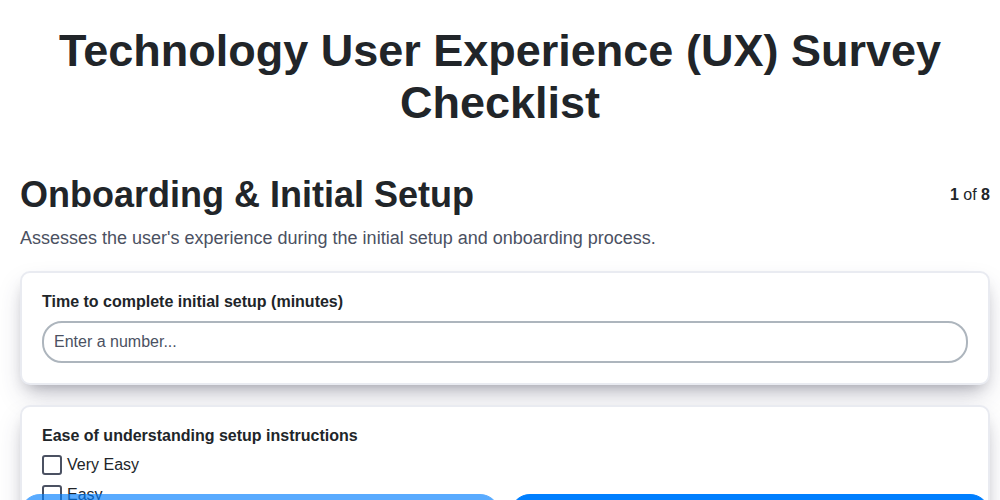
Table of Contents
- Why You Need a UX Survey Checklist
- Choosing the Right Survey Tool
- Section 1: Onboarding & First Impressions
- Section 2: Navigation & Information Architecture
- Section 2.1: Task Flows & Efficiency
- Section 3: Core Feature Deep Dive
- Section 4: Visual Design & Branding
- Section 5: Accessibility & Inclusivity
- Section 6: Performance & Reliability
- Section 7: Help & Support Evaluation
- Section 8: Gauging Overall Satisfaction & NPS
- Turning Feedback into Actionable Insights
- Resources & Links
TLDR: Need to understand how users *really* feel about your tech product? This checklist template (explained in the blog) walks you through key areas - onboarding, navigation, features, design, accessibility, performance, support, and overall satisfaction - to gather actionable feedback and improve your user experience.
Why You Need a UX Survey Checklist
Beyond simply gauging user satisfaction, a structured UX survey checklist provides invaluable strategic benefits. It moves you from reactive problem-solving - addressing issues after they've surfaced - to a proactive, data-driven approach to product development. A checklist ensures consistency in your feedback collection, allowing you to track UX improvements over time and benchmark against competitors. It also acts as a powerful communication tool, aligning design, development, and product teams around a shared understanding of user needs. Without a checklist, you risk missing critical pain points or overlooking opportunities for innovation that could significantly impact user adoption and overall business success. It's about building a product with your users, not just for them.
Choosing the Right Survey Tool
Picking the right survey tool is almost as important as crafting insightful questions. Thankfully, you're spoiled for choice! Each platform boasts unique features and pricing structures, so consider your needs and budget carefully.
Free & Accessible: Google Forms is a fantastic starting point, especially for smaller teams or those on a tight budget. It's easy to use, integrates seamlessly with Google Sheets for data analysis, and offers a decent range of question types.
Feature-Rich & Scalable: SurveyMonkey is a popular choice with robust features, including advanced analytics, branching logic (showing different questions based on previous answers), and customizable branding. However, the free plan is limited, and premium features can be costly.
Visually Appealing & Engaging: Typeform excels in creating beautiful, interactive surveys that offer a more conversational feel. This can lead to higher completion rates, but it comes at a premium price point.
Enterprise-Level Power: Qualtrics is a heavy-duty platform designed for large organizations needing advanced analytics, complex logic, and integrations with other enterprise systems. Prepare for a significant investment.
Consider these factors when making your decision:
- Budget: What can you realistically spend on a survey tool?
- Features: Do you need branching logic, advanced analytics, or custom branding?
- Ease of Use: How comfortable are you and your team with technology?
- Integrations: Does the tool need to connect with other systems?
- Security & Privacy: What level of data security and privacy do you require?
Don't be afraid to try out free trials of a few different tools before committing to one.
Section 1: Onboarding & First Impressions
Your onboarding experience is often a user's very first interaction with your product. It'll make or break their willingness to stick around. A clunky, confusing setup can send users packing before they even understand the value you offer. Think of it as your digital handshake - you want it to be warm, welcoming, and set the stage for a great relationship.
Too many users abandon products simply because they find the initial setup too difficult. Maybe the instructions are unclear, the process is too long, or they're bombarded with too many steps before they can actually use the product. This isn't just about ease of use; it's about building confidence and creating a positive first impression.
Consider the user's perspective: they're new, potentially unfamiliar with your interface, and eager to get started. Minimize friction, guide them clearly, and focus on delivering value as quickly as possible. A simple, intuitive onboarding flow demonstrates you respect their time and understand their needs. Are you providing contextual help? Are you showing them the "wow" factor early on? These little details can make a huge difference between a loyal user and a lost opportunity.
Section 2: Navigation & Information Architecture
A well-structured navigation system isn't just about aesthetics; it's the backbone of a positive user experience. Think of it as a roadmap-if your users get lost, they're likely to abandon their journey. Intuitive navigation allows users to effortlessly find what they're looking for, whether it's a specific setting, a key feature, or a piece of helpful information.
Consider how users naturally expect to navigate a product. Do they anticipate a persistent menu? Breadcrumb trails? A robust search function? Don't reinvent the wheel unless you have a very good reason. Consistent labeling and clear visual hierarchy are paramount. A button labeled Settings should always lead to settings, not something else entirely.
Information architecture (IA) goes hand-in-hand with navigation. It's the art of organizing and structuring your content in a logical and understandable way. A chaotic information hierarchy leaves users feeling overwhelmed and frustrated. Card sorting exercises, where users physically group content items, can be invaluable for understanding how people naturally categorize information and informing your IA design. Regular usability testing focused on navigation and information discovery is also crucial to ensure your design is truly user-friendly.
Section 2.1: Task Flows & Efficiency
Task flows, also known as user flows, visually map out the steps a user takes to complete a specific task within your product. They aren't just pretty diagrams; they've become essential for identifying bottlenecks and optimizing efficiency. Think of it as tracing the user's footsteps as they navigate your application - you'll quickly uncover areas of friction.
Why are task flows so crucial? Because they help you answer these critical questions:
- Are there unnecessary steps? Each extra click or screen adds to cognitive load.
- Are instructions clear? Confusion leads to abandonment and frustration.
- Can the task be completed with minimal effort? The easier it is, the more likely users are to succeed.
- Are there alternative paths that could be more efficient? Consider offering shortcuts or personalized options.
Creating Effective Task Flows:
- Define the Task: Clearly identify the specific task you want to analyze (e.g., Creating a new project, Uploading a document, Sharing a file).
- Identify Starting and Ending Points: Where does the user begin, and what constitutes a successful completion of the task?
- Map the Steps: Document each action the user takes, including clicks, form submissions, and decisions.
- Consider Different User Personas: Task flows may vary depending on the user's experience level or role.
- Analyze and Iterate: Look for areas where users might get stuck or where the process can be simplified. Don't be afraid to redesign based on your findings.
(Image Suggestion: A sample task flow diagram illustrating a simple process, like uploading a photo.)
Section 3: Core Feature Deep Dive
Your product likely has several core features - those functionalities users rely on most to achieve their goals. Going beyond general satisfaction, a core feature deep dive reveals precisely how users interact with these critical components and where they stumble. This isn't just about knowing if a feature is used; it's about uncovering how it's used and identifying friction points.
Moving Beyond Does it Work?: Focus on the User Journey
Instead of simply asking Did you use Feature X?, break down the user journey into smaller steps. Consider:
- Discovery: How did users find the feature? Was it obvious, or did they have to search?
- Initial Use: What was their first impression? Was the function clear and understandable?
- Regular Use: How frequently do they use it? For what specific tasks?
- Problem Areas: What are the most common roadblocks or frustrations they encounter?
Example: Let's say you have a photo editing app with a Filters feature.
Instead of just asking Did you use the Filters feature?, you might ask:
- How easy was it to find the Filters feature? (Scale: Very Easy - Very Difficult)
- Describe the steps you took to apply a filter to a photo. (Open-ended)
- Did you find the filter descriptions helpful? If not, why? (Scale: Yes - No - Explain)
- What, if anything, would make the Filters feature more useful? (Open-ended)
Combining Quantitative and Qualitative Data:
Use a combination of quantitative (rating scales, frequency counts) and qualitative (open-ended feedback) questions. Quantitative data provides measurable insights, while qualitative data provides the why behind the numbers. Analyzing both together paints a complete picture of feature usage and user experience. Finally, don't forget to link back to the wider UX survey findings to look for patterns - does difficulty finding a feature correlate with overall satisfaction?
Section 4: Visual Design & Branding
Visual design isn's just about making things pretty. It's a critical component of usability and brand perception. A well-executed visual design enhances user engagement, guides navigation, and reinforces your brand identity. Conversely, a confusing or inconsistent visual experience can frustrate users and damage trust.
Here's how to elevate your product's visual design and ensure it aligns with your brand:
1. Brand Alignment is Paramount: Your visual design should be a direct extension of your brand guidelines. This includes color palettes, typography, imagery style, and overall tone. Don't deviate unless there's a strategic and well-justified reason.
2. Typography: Readability & Hierarchy: Choose fonts that are legible and accessible across different devices and screen sizes. Establish a clear typographic hierarchy-use different font sizes, weights, and styles to guide users through content and highlight important information.
3. Color Psychology & Accessibility: Colors evoke emotions and influence user behavior. Choose a color palette that reflects your brand's personality and creates the desired mood. Critically, ensure sufficient contrast between text and background for accessibility (WCAG guidelines are a great resource).
4. Imagery: Quality and Relevance: Use high-quality images and illustrations that are relevant to your product and target audience. Avoid generic stock photos; opt for authentic visuals that resonate with your brand's story. Consider using a consistent visual style for all your imagery.
5. Whitespace (Negative Space): Breathing Room for the Eye: Don't underestimate the power of whitespace. Adequate whitespace improves readability, reduces visual clutter, and gives your design a sense of clarity and sophistication.
6. Consistency is Key: Maintain a consistent visual style throughout your entire product. This includes button styles, icon usage, form fields, and other recurring design elements. A unified visual language builds familiarity and reinforces your brand identity.
7. Microinteractions: Delightful Details: Consider adding subtle microinteractions (e.g., hover effects, animations) to provide feedback to users and add a touch of delight to the user experience. But remember, less is often more - avoid unnecessary animations that can distract or annoy.
8. Regularly Review & Iterate: Visual design isn's a set it and forget it exercise. Regularly review your visual design based on user feedback and analytics, and be prepared to iterate and make adjustments as needed to ensure optimal user engagement and brand consistency.
Section 5: Accessibility & Inclusivity
Designing for accessibility isn't just about compliance; it's about creating a product that everyone can use and enjoy. It's about inclusivity. This means considering the needs of users with a wide range of abilities, including those with visual, auditory, motor, and cognitive impairments.
Here are a few key considerations for making your product more accessible:
- Alternative Text (Alt Text) for Images: Always provide descriptive alt text for images, so screen readers can convey the content to visually impaired users. Think beyond just "image of a dog" - describe the dog's actions, breed, and significance to the context.
- Keyboard Navigation: Ensure all interactive elements (buttons, links, form fields) can be accessed and operated using only the keyboard. Many users rely on keyboard navigation due to motor impairments.
- Color Contrast: Maintain sufficient color contrast between text and background, especially for users with low vision or color blindness. Tools are readily available to check contrast ratios.
- Clear and Simple Language: Use clear, concise language, avoiding jargon and complex sentence structures. This benefits users with cognitive disabilities as well as those who are not native speakers.
- Resizable Text: Allow users to easily resize text without breaking the layout or affecting functionality.
- Captions and Transcripts: Provide captions for videos and transcripts for audio content.
- Form Labels: Properly label all form fields to guide users and assist screen reader users.
- Semantic HTML: Use semantic HTML elements (e.g.,
<header>,<nav>,<article>,<footer>) to structure content in a meaningful way that screen readers can interpret.
Remember, accessibility is an ongoing process. Regularly review your product and incorporate feedback from users with disabilities to ensure a truly inclusive experience. Consider involving users with disabilities in your testing process for the most valuable insights.
Section 6: Performance & Reliability
Slow load times, frequent crashes, and unexpected errors - these are the nightmares of any user. A product that's unreliable and sluggish doesn't just frustrate; it actively pushes users away. Performance and reliability are often overlooked in the rush to add new features, but they're foundational to a positive user experience.
But how do you measure performance and reliability from the user's perspective? It's not just about server response times (though those are important!). It's about how your users perceive the product's responsiveness and stability.
Here's what to explore in your survey:
Beyond the Numbers: User-Centric Questions
- Rate Overall Speed: "How would you rate the overall speed of this product?" (Scale: Very Slow - Very Fast) This captures the overall feeling of responsiveness.
- Crash & Error Frequency: "Have you experienced any crashes or errors while using this product?" (Yes/No). If yes, include a follow-up: "Can you briefly describe what happened?" Qualitative feedback here is invaluable for diagnosing specific issues.
- Stability Perception: "How stable do you find the product to be?" (Scale: Very Unstable - Very Stable) This gets at the feeling of predictability and dependability.
- Specific Task Performance: "Did you experience any delays or issues while completing [Specific Task, e.g., uploading a file, processing a payment]?" Tailor this to key user workflows.
Why This Matters:
Negative experiences related to performance and reliability are often the first to drive users to competitors. By proactively identifying and addressing these issues through user feedback, you can not only improve your product but also boost user retention and build a reputation for quality. Don't just optimize for speed; optimize for perception of speed and reliability.
Section 7: Help & Support Evaluation
Effective help and support are the safety net for frustrated users. A clunky, unhelpful support system can quickly erode user satisfaction, even if your product is brilliant. But how do you know if your help resources are actually helping? Let's break down how to evaluate them.
Your survey should go beyond simply asking, Was the help useful? Dig deeper to understand why users sought help in the first place, and how effective your solutions were. Consider these questions:
- Ease of Discovery: Was the help documentation or support section easy to find within the product? (e.g., prominent help icon, clear navigation). A hidden help section is as good as no help at all.
- Content Relevance: Did the available resources actually address the user's specific issue? Generic answers or outdated information are common frustrations.
- Format & Clarity: Was the information presented in a clear, concise, and easy-to-understand format? (Consider video tutorials, FAQs, knowledge base articles). Avoid technical jargon that might confuse less experienced users.
- Response Time (for direct support): If users contacted you directly (e.g., email, chat), how long did it take to receive a response? Timeliness is crucial for maintaining user trust.
- Resolution Effectiveness: Did the help resources or support interaction ultimately resolve the user's problem? A partial or temporary fix leaves users feeling unresolved.
- Self-Service Success: For users who attempted to solve the problem themselves, were they successful in finding the information they needed? This indicates the strength of your self-service resources.
Analyzing responses to these questions will reveal where your support system excels and, crucially, where it needs improvement. A dedicated, easy-to-navigate, and truly helpful support system is a key differentiator for user retention and satisfaction.
Section 8: Gauging Overall Satisfaction & NPS
The overall satisfaction question and the Net Promoter Score (NPS) are crucial indicators of your product's success, but they're just the starting point. A score alone doesn't tell the full story. It's the why behind the numbers that unlocks valuable insights for improvement.
What is NPS, Exactly?
NPS classifies users into three groups:
- Promoters (9-10): These are your biggest fans - they'll recommend your product to others.
- Passives (7-8): These users are satisfied but not enthusiastic. They're vulnerable to competitors.
- Detractors (0-6): These users are dissatisfied and likely to spread negative word-of-mouth.
Your NPS is calculated as: % Promoters - % Detractors. A score above 0 is considered good, while a score above 50 is excellent.
Digging Deeper with Qualitative Follow-Up
After asking the satisfaction question and calculating NPS, always include an open-ended follow-up question like: Could you briefly explain why you gave that score? or What's the one thing that most impacted your rating?. These responses provide context and reveal the specific pain points and delights that drive user sentiment.
Turning Feedback into Action
Analyze both the quantitative (NPS score) and qualitative data to identify actionable improvements. For example, a low NPS combined with comments about confusing navigation points directly to a usability issue needing immediate attention. Conversely, glowing praise about a specific feature can reinforce its value and guide future development. Don't just measure satisfaction - understand it, and use that understanding to build a product your users truly love.
Turning Feedback into Actionable Insights
Collecting feedback is only half the battle. The real magic happens when you transform that data into concrete improvements. It've got your responses - now what?
1. Centralize & Categorize: Consolidate your survey data in a spreadsheet or dedicated feedback management tool. Categorize responses by theme (e.g., Navigation, Performance, Onboarding). This makes it easier to spot recurring issues.
2. Prioritize with Impact & Effort: Not all feedback is created equal. Use a simple matrix: Impact (How much does this affect the user experience?) vs. Effort (How much time and resources will it take to fix?). Focus on Quick Wins (high impact, low effort) and strategically tackle "Major Projects" (high impact, high effort). Don't ignore Fill-Ins (low impact, low effort) - they can add up to significant improvements.
3. Share, Discuss, and Align: Don't keep the feedback siloed! Share the findings with your team - designers, developers, product managers. A cross-functional discussion ensures everyone understands the issues and can contribute to solutions.
4. Create Actionable Tasks: For each recurring theme or significant piece of feedback, translate it into a specific, measurable, achievable, relevant, and time-bound (SMART) task. Assign ownership and set deadlines.
5. Close the Loop: Communicate Back to Users: Let your users know you're listening! Even a simple message acknowledging their feedback and outlining planned improvements shows that you value their input. This fosters loyalty and encourages continued participation in future surveys. Thanks for your feedback! We're working on improving [specific area] based on your suggestions - expect updates soon!
Resources & Links
- Nielsen Norman Group : Leading UX research and consulting firm. Provides extensive articles, reports, and training on user research methods, including survey design and analysis. Excellent for understanding best practices in UX research and identifying key metrics to track.
- USABILITY.GOV : Government website dedicated to usability and accessibility. Offers guidelines, checklists, and resources for conducting user research and evaluating digital products, including survey design and accessibility considerations.
- SurveyMonkey : Popular online survey platform. Offers templates, question types, and data analysis tools. Useful for creating and distributing UX surveys. Offers free and paid plans.
- Google Forms : Free online survey tool integrated with Google Workspace. Simple to use for creating basic UX surveys and collecting responses. Integrates directly with Google Sheets for data analysis.
- Typeform : Known for its conversational and visually appealing survey format. Can be a good choice for gathering more qualitative feedback and improving user engagement with the survey.
- Qualtrics : Enterprise-level survey platform offering advanced analytics, reporting, and customization options. Suited for larger companies with complex UX research needs.
- Hotjar : Provides heatmaps, session recordings, and feedback polls. While not solely a survey tool, these features can provide valuable contextual information to complement your survey data and understand user behavior.
- Optimizely : Focuses on A/B testing and experimentation, but offers insights that inform survey design and can be used to evaluate the impact of UX changes. Good for measuring the effectiveness of survey feedback implementation.
- Accessibility Insights : Microsoft's tool for evaluating website accessibility. Essential for ensuring your product and surveys are inclusive and usable by people with disabilities, aligning with Section 1: Onboarding & First Impressions and Section 5: Accessibility & Inclusivity.
- WCAG (Web Content Accessibility Guidelines) : International standard for website accessibility. Provides detailed guidelines for creating accessible content, directly supporting the Accessibility & Inclusivity section.
- Crazy Egg : Heatmap and A/B testing tool similar to Hotjar. Provides visual insights into user behavior and can help identify areas for UX improvement before, during and after survey implementation. Useful for Section 2.1: Task Flows & Efficiency and Section 4: Visual Design & Branding.
- G2 - Survey Software : Provides a comprehensive list of survey software options with user reviews and comparisons. Helps in choosing the right tool based on specific needs and budget.
Frequently Asked Questions
What is a UX survey and why is it important for tech products?
A UX survey is a data collection method used to gather feedback on the usability and overall experience of a tech product. It's important because it provides valuable insights directly from your users, allowing you to identify pain points, understand user behaviors, and ultimately improve your product's design and functionality, leading to increased user satisfaction and engagement.
What's included in the 'Ultimate UX Survey Checklist Template'?
The checklist covers key areas including defining survey goals, choosing the right survey platform, crafting effective questions (covering demographics, task completion, satisfaction, and more), testing the survey, distributing it to the target audience, analyzing the results, and taking action based on the feedback. It also provides guidance on question types and best practices.
Who should use this checklist?
This checklist is beneficial for UX designers, product managers, researchers, and anyone involved in improving the user experience of a tech product. It's suitable for both new and experienced professionals looking for a comprehensive guide.
What types of questions should I include in my UX survey?
The checklist suggests a mix of question types: multiple-choice, rating scales (Likert scales, Net Promoter Score - NPS), open-ended questions, and demographic questions. The choice depends on the specific information you're trying to gather. The template provides examples for each type.
How do I ensure my survey questions are unbiased?
The checklist emphasizes using neutral language, avoiding leading questions, and ensuring questions are clear and unambiguous. Pilot testing the survey with a small group before full distribution is highly recommended to identify any potential biases.
What's the best way to distribute the survey?
The checklist covers various distribution methods including email, in-app prompts, website pop-ups, social media, and user communities. The optimal choice depends on your target audience and resources.
How can I analyze the survey results effectively?
The checklist outlines steps for data cleaning, basic statistical analysis (e.g., calculating averages, percentages), identifying trends, and segmenting responses to uncover valuable insights. It also encourages visualizing data for clearer understanding.
What should I do with the insights gained from the UX survey?
The checklist emphasizes the importance of acting on the feedback. This includes prioritizing issues, creating action plans, implementing design changes, and continuously monitoring the impact of those changes on user experience. It's not enough to just collect data; you must use it to improve your product.
Is this checklist customizable?
Yes, the checklist is designed to be a guide. Feel free to adjust it based on your specific product, target audience, and survey goals. Add or remove items as needed to tailor it to your unique requirements.
Found this Article helpful?
Survey Management Solution Demo
Gather valuable insights with ease! ChecklistGuro simplifies survey creation, distribution, and analysis. Automate data collection, improve response rates, and make data-driven decisions. Manage it all with our Work OS.
Related Articles
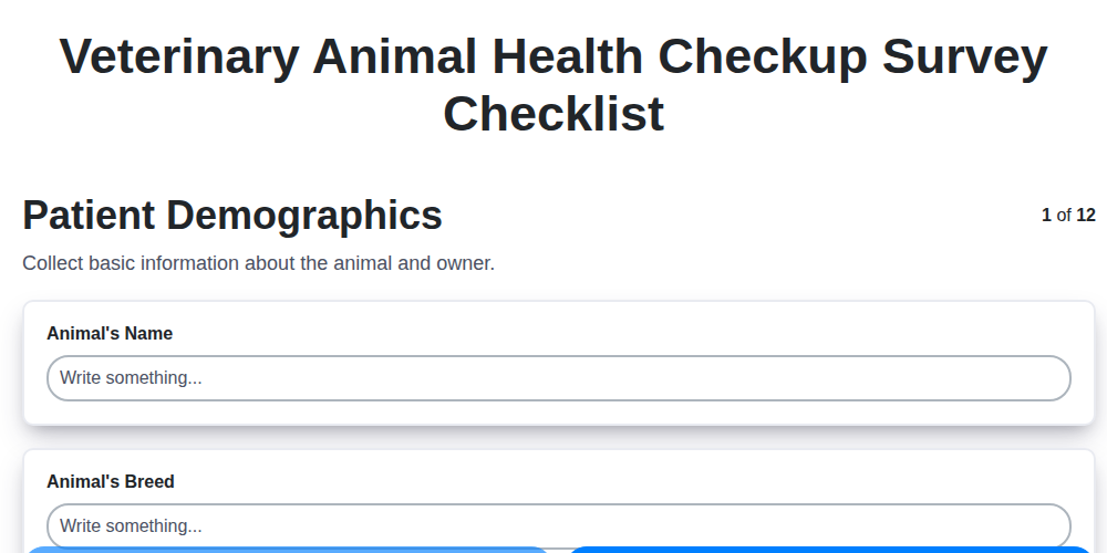
The Ultimate Veterinary Animal Health Checkup Survey Checklist Template
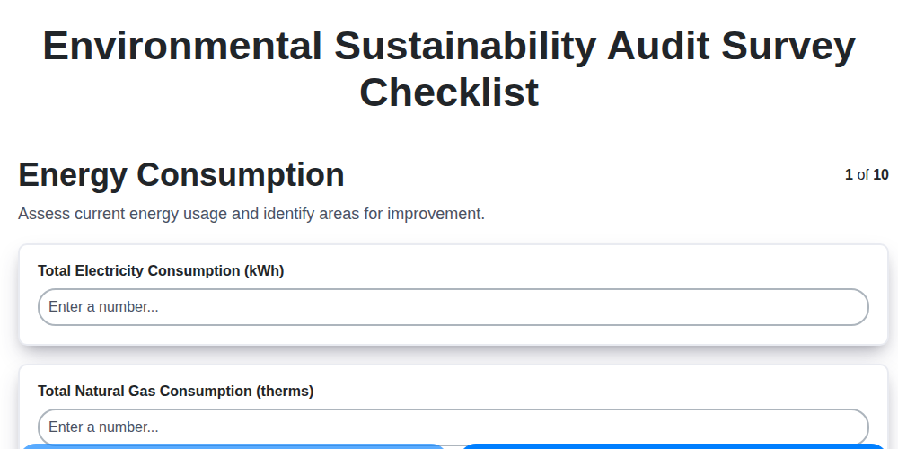
Your Guide to a Green Business: The Environmental Sustainability Audit Checklist
Paper vs ChecklistGuro in Survey Management
Construction Site Safety Survey Checklist Template
A Checklist for Congregant Feedback: Template for Religious Organizations
Excel vs ChecklistGuro in Survey Management
Mastering the Policyholder Journey: Your Insurance Experience Survey Checklist
Real Estate Property Condition Survey Checklist Template
We can do it Together
Need help with
Survey Management?
Have a question? We're here to help. Please submit your inquiry, and we'll respond promptly.